The Best Green Front Door Colors to Refresh, Impress, and Invite
Disclosure : This post may contain affiliate links or paid partnerships. I may earn compensation if you click a link or make a purchase, at no additional cost to you. See my disclosure for more info.
Your front door has been bothering you for a while now.
It might have been months.
Every time you park and walk up to the house, something nags at you. The color looks exhausted. Old. It whispers “forgotten decade” when what you want is a door that announces your personality.
You’ve combed through inspiration boards until your patience ran dry. Bookmarked more ideas than you could ever use. And somehow you feel less certain than before you started.
Here’s the truth. Your front door is the opening line of your home’s story. It’s the first thing every guest, every courier, every neighbor glimpses as they approach.
And right now? That opening line is flat.
You’re drawn to green. You can sense it. Something vibrant. Something that reads polished without being overbearing. Something that makes your house look intentional — but still comfortable.
The challenge? The green spectrum is enormous. Choosing badly can leave your home looking garish, institutional, or simply out of date.
You’re not here for that.
So let’s cut to it. Right here. You’re about to learn the best green front door colors that consistently deliver — and, more importantly, why each one works, so you can choose with confidence.
Why a Green Front Door Is a Smarter Choice Than Most People Realize
Before we get into individual shades, let’s talk about what makes green such an effective option for a front door.
Green is the color the human eye registers most naturally. It occupies the center of the visible spectrum. This isn’t subjective — it’s physiology.
That means green tends to feel calming. Harmonious. Welcoming.
But here’s the more interesting point from a curb-appeal standpoint.
Green is one of the only colors that reads well against virtually every exterior finish. Red brick? Elegant. Fieldstone? Gorgeous. Painted wood? Perfect. White clapboard? Effortlessly classic.
Most accent colors can’t claim that. Blue can feel sterile in the wrong light. Red can fight with warm brick. Yellow can overpower a modest facade.
Green holds its ground without competing.
It also carries emotional resonance. Green speaks to growth, renewal, and hospitality. On an instinctive level, a green front door communicates: this is a home worth coming to.
Quite a lot of weight for a single coat of paint.
Now let’s move to the shades that actually get the job done.
1. Sage Green — Understated Refinement
If your taste leans toward quiet elegance, sage green belongs on your shortlist.
The gray undertones in sage prevent it from reading overly rustic or herbal. It projects calm sophistication without formality.
This shade pairs exceptionally well with warm whites, natural linen trims, and stone exteriors. Picture classic farmhouse aesthetics. Picture a seaside home with genuine history.
Where sage performs best is alongside warm-toned exteriors. If your brick or stone carries amber, blush, or golden notes, sage will harmonize rather than compete.
Pro tip: Sage has a tendency to lose its depth under intense direct sunlight. If your entry faces south and gets heavy afternoon exposure, go one shade richer than the chip you love. Paint tends to dry slightly lighter on the door than it looks in the store.
It just does.
2. Hunter Green — The Enduring Standard
Hunter green is the dark suit of front door palettes.
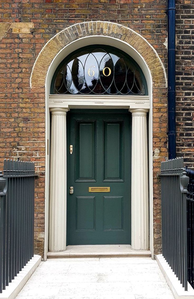
It has anchored Georgian townhouses for generations. It works on Craftsman cottages. It holds its own on contemporary facades with expansive glazing.
Why? Hunter green functions almost as a dark neutral. It carries the authority of black but with underlying warmth. It has the richness of navy but feels more alive.
If you want a door that looks considered — the kind that draws a second look from the street — hunter green paired with polished brass hardware is a combination that rarely fails.
Brass door knocker. Brass kick plate. Brass house numbers.
That pairing works reliably, every single time.
Where it falls short: Against very cool, blue-based gray exteriors. Hunter green carries yellow undertones that can create visual tension with blue-gray siding. If your home runs cool, there’s a better option a bit further down this list.
3. Olive Green — Warm, Grounded, Understated
Olive green doesn’t chase attention. And that restraint is precisely what makes it brilliant.
It occupies the territory between green and brown, giving it a deeply organic, settled character. Olive earns admiration slowly, from people who actually notice things.
This shade is exceptional on properties embedded in natural settings. Wooded lots, drought gardens, gravel paths. If your home’s environment is part of its character, olive green allows the door to feel like it belongs to the land rather than sitting in front of it.
It also holds up well next to dark exterior schemes. Charcoal fiber cement, deep brown wood shingles, matte black window frames.
Where many greens struggle against very dark surrounds, olive navigates the gap. It’s alive enough to read as a color, but composed enough to feel intentional.
One note of caution: Olive can trend toward muddy under dim or shadowed conditions. If your entryway sits inside a deep covered porch, test your sample specifically in that light. The chip under fluorescents and the same paint on a shaded door can look completely unrelated.
4. Emerald Green — Bold and Unapologetic
Want your front door to be the focal point of the whole block?
Emerald green doesn’t request attention. It commands it. That’s not a warning — it’s the entire point.
This is a jewel tone. Dense, saturated, and unmistakably luxurious. Think of it as the velvet armchair of front door choices. It turns even a basic entryway into something that reads as deliberate and designed.
Emerald demands high contrast. Crisp white trim is non-negotiable. The interplay between clean white and deep emerald creates exactly the visual impact you’re after.
Hardware choices carry real weight here, too. Matte black handles and hinges give emerald a contemporary sharpness. For something more classical, antique brass leans into old-world richness.
Where emerald performs at its peak: Homes with strong architectural character. Molding, sidelights, transom windows, or a paneled door with real depth will showcase emerald to its full potential.
If your door is flush and plain, emerald may feel underwhelming. In that case, consider swapping in a paneled door before you open the paint can. The transformation will be remarkable.
5. Forest Green — Weight Without Showiness
Forest green sits in its own register between hunter and emerald, and it earns that space.
It’s darker than emerald. Less flashy in quality. More grounded, more deliberate — the difference between a buzzing event and a long, considered dinner conversation.
Forest green communicates permanence. It says: this home has stood its ground for years, and it intends to keep doing so. Dependable. Solid. Trustworthy.
For traditional and Colonial-style homes, forest green is practically purpose-built. White or ivory trim, black shutters, and a classic panel door create the kind of curb appeal that photographs well and ages even better.
And from a practical standpoint — deeper greens consistently signal a thoughtfully maintained home to outside observers. Prospective buyers, neighbors, and guests read it as care and intention.
You’re not just freshening a coat of paint. You’re making a deliberate statement about your home’s character.
6. Mint Green — The Unexpected and Charming
This one takes a measure of conviction.
Mint green is light, lively, and unmistakably fresh. It’s the front-door equivalent of a warm breeze cutting through a summer afternoon.
Does it suit every home? Genuinely, no.
But when the conditions are right, it absolutely sings.
Mint is at its best on beach houses, tropical-inspired bungalows, and neighborhoods where personality is the default. It also reads beautifully on mid-century modern properties with precise geometry and stripped-back detailing.
The key to executing mint without it tipping into novelty? Keep everything surrounding it simple. A white or pale gray exterior. Minimal accessories. Give the door sole ownership of the moment.
Layer too many competing elements around a mint door and the effect starts to feel playful rather than refined. That can work in some contexts. But most homeowners looking for elegance should let the door do the talking and step everything else back.
7. Eucalyptus Green — The Contemporary Neutral
This is the shade that’s been showing up in architect portfolios and interior design showcases for several years running.
Eucalyptus sits between sage and mint. It borrows sage’s softness but adds a cooler, mildly blue cast that gives it a distinctly modern sensibility.
If your home exterior leans cool — gray clapboard, blue-veined stone, bright white brick — eucalyptus green will feel as though it was designed specifically for your house.
It also pairs naturally with matte black hardware, concrete planters, and modern house numbers. The modern-organic movement has essentially adopted eucalyptus as its signature exterior color.
Styling note: Flank a eucalyptus door with potted greenery — living plants, not artificial — and the transition from landscape to entryway becomes invisible. The door reads as part of the environment. That integration is the difference between curb appeal that’s attractive and curb appeal that’s considered.
How to Commit to the Right Green Without Second-Guessing Yourself
You’ve reviewed the options. One or two shades probably caught your attention right away.
Before you order a gallon and reach for the brush, here are the principles that separate front doors people love from the ones they repaint eighteen months later.
1. Always test a physical sample on your actual door. Screens are unreliable. Every device — your phone, your monitor, your tablet — renders color differently. Order a peel-and-stick swatch or paint a board and live with it for several days. Observe it in morning light, midday sun, and the golden hour before dusk.
2. Work with your fixed elements. Your roof pitch, your masonry, your walkway surface, your driveway material — none of these are changing. The green you choose must make peace with all of them.
3. Sheen changes everything. The same color in gloss and in matte reads as two completely different choices. Gloss amplifies depth and shows flaws. Satin sits in the middle — forgiving, polished, appropriate for almost any front door.
4. Paint the edges too. When the door swings open, the edges are visible. Match them to the face. It’s a minor detail with an outsized effect on whether the result reads as professional or hasty.
5. Consider your door through all four seasons. Deep hunter green under an autumn fall wreath looks extraordinary. But will it work with your summer planters in July? The strongest front door colors carry beautifully across the entire calendar.
Your Front Door Won’t Wait Forever
You now have something most homeowners spend months trying to find: genuine direction.
You understand which shades perform. You know which ones align with your architecture, your taste, and your instincts.
The path from here splits in two.
Option one: Continue living with a front door that feels off, scrolling past ideas without acting, watching more seasons pass without a change.
Option two: Commit to the shade that excited you while reading this. Get the sample. Pin it to your door. Notice how it shifts the feeling of the whole exterior.
Because here’s what seldom gets said about painting a front door.
It isn’t really about the paint. It’s about deciding that your home should look the way you want it to look. That the first impression your house makes on the world should be a deliberate one.
Fresh. Refined. Welcoming.
That’s the promise of the right green.
And now you know exactly how to keep it.