Warm, Sleek, and Timeless — 29 Ways to Nail the Perfect Beige Kitchen
Disclosure : This post may contain affiliate links or paid partnerships. I may earn compensation if you click a link or make a purchase, at no additional cost to you. See my disclosure for more info.
You’ve got seventeen Pinterest boards dedicated to kitchens.
Maybe more. You’ve lost count.
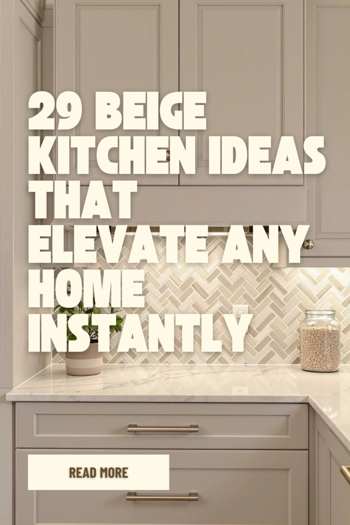
Every single one is flooded with the same thing. Soft, sandy tones. Creamy surfaces catching golden light. Cabinets that look like they were carved from warm stone.
And every single time you put your phone down, you feel it.
That ache between what you’re dreaming about and what you’re actually standing in.
Your kitchen doesn’t glow. It doesn’t whisper luxury. It whispers “contractor special” and hums with the faint buzz of a light fixture that should’ve been replaced years ago.
You want to change it. Desperately.
But the fear is real. What if you pick the wrong shade? What if it looks muddy? What if you spend a fortune and end up with something that looks worse than what you started with?
Here’s the thing.
Beige done right is magnetic. It pulls people in. It makes a kitchen feel like it’s wrapped in cashmere. But beige done wrong is a cardboard box.
The difference? These 29 tricks.

Every single one matters. And I’ve laid them out in the exact order that’ll help you see your kitchen differently — starting with the element most people completely overlook.
Let’s get into it.
The Element Everyone Ignores: Why Texture Makes or Breaks a Beige Kitchen
A beige kitchen without texture is like a voice without emotion. Technically present. Emotionally vacant.
This is the make-or-break factor. And most people skip right past it.
1. Lay down zellige tiles on your backsplash.
Zellige is handmade. Every tile carries tiny imperfections — slight color shifts, uneven surfaces, different ways of catching light.
In cream or sandy tones, a zellige backsplash doesn’t just sit there. It breathes. It has depth and character that machine-made tiles simply cannot replicate.
Standard subway tile? Forgettable. Zellige? The kind of thing guests walk up to and touch.
2. Wrap your range hood in hand-applied plaster.
Ditch the stainless steel hood. Instead, coat it in limewash, Venetian plaster, or Roman clay in a tone that matches your walls.
The texture shifts as daylight moves through the room. Morning light reveals one thing. Evening light reveals another. Your hood stops being an appliance and starts being a sculptural centerpiece.
3. Introduce warm-toned wood through floating shelves.
Honey oak. White oak. Light walnut.
Two open shelves floating between or in place of upper cabinets bring organic warmth that prevents your beige palette from reading flat.
Stack a few bowls. Lean a wooden board against the wall. Let it look collected, not curated.
4. Place a natural fiber runner at your feet.
Jute. Sisal. Woven wool.
A textured runner in front of the sink or along the island softens the hard surfaces, adds visual warmth, and tells anyone walking in that this kitchen is made for living — not just cooking.
Your feet will notice the difference before your eyes do.
5. Hang a woven pendant above the island.
One organic light fixture shifts the entire energy of the room. A rattan or woven pendant throws soft shadow patterns across your beige surfaces, creating movement that smooth finishes alone could never produce.
The Glow Factor: Lighting Moves That Bring Beige to Life
Every design decision you’ve made up to this point can be undone by bad lighting. Beige is extremely sensitive to the light that hits it.
Get this right or nothing else matters.
6. Switch every bulb to warm tones — 2700K to 3000K.
Cool-toned bulbs drain the warmth right out of beige. They turn it gray. Sometimes greenish. Always wrong.
Warm bulbs make beige radiate like golden hour sunlight pouring through the window. Check the Kelvin rating on every bulb in the room. Swap the bad ones. The shift is immediate.
7. Run LED strips under your upper cabinets.
Under-cabinet lighting bathes your countertops and backsplash in a soft, ambient wash of light. Shadows disappear. Your surfaces get highlighted. Your zellige tiles start to shimmer.
At night, when the overheads are off? That gentle glow turns your kitchen into the room everyone gravitates toward.
8. Install a dimmer on your main overhead light.
Full power for meal prep. Lowered for dinner with friends.
A dimmer hands you total control over atmosphere. And in a beige kitchen, atmosphere is everything — because beige shifts dramatically depending on how much light touches it.
The Visual Anchor: Cabinet Decisions That Define the Whole Room
Cabinets occupy more visual space than anything else in your kitchen. They set the tone for the entire room before anyone notices a single other detail.
9. Lean into shaker-style door profiles.
Flat-panel doors can feel sterile. Ornate raised panels age quickly.
Shaker style threads the needle perfectly — clean enough to feel modern, detailed enough to feel intentional. It’s a silhouette that has never fallen out of favor and likely never will.
10. Extend your uppers all the way to the ceiling line.
That dusty gap between cabinet tops and ceiling? It makes even beautiful kitchens look like afterthoughts.
Floor-to-ceiling cabinetry adds height, intention, and a level of polish that screams “this was designed on purpose.” One structural change, enormous visual payoff.
11. Split your tones — lighter above, richer below.
Creamy white or pale beige uppers keep things bright and airy. A deeper sand or wheat tone on the lowers grounds the space and hides daily wear.
The only rule: both tones must share the same undertone. Yellow-beige on top with pink-beige on bottom creates visual friction that no accessory can fix.
12. Add vertical fluting to your island panels.
A smooth, flat island front reads like an unfinished slab. But fluted or reeded panels add dimension, shadow play, and architectural interest that turn a basic island into a statement piece.
This single upgrade can make a modest budget look like a luxury renovation.
13. Skip handles on uppers, add hardware on lowers only.
Clean, uninterrupted upper cabinets draw the eye upward, making your kitchen feel taller.
Hardware at hand level — a soft brass pull, a curved handle — provides the texture and function right where your hands actually reach. Strategic. Minimal. Effective.
Tiny Details, Outsized Results: Fixtures and Hardware
You’d be amazed at what a few small metal pieces can do to a room.
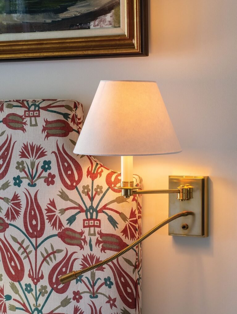
14. Reach for unlacquered brass or champagne gold.
Chrome reads too cold against warm beige. Matte black can feel heavy.
Unlacquered brass ages beautifully — it develops a patina that gets richer over time. Champagne gold offers the same warmth with a cleaner, more consistent finish.
Both are winners. Pick whichever speaks to you.
15. Match your faucet metal to your cabinet pulls.
Intentional metal mixing can work. But if you’re not fully confident about it, don’t risk it.
Same finish on faucet, knobs, and pulls. Cohesion creates calm. Calm creates luxury.
16. Replace your outlet covers with wall-matching ones.
Sixty seconds. Almost zero cost.
But those bright white plastic plates sitting on your warm beige walls? They’re visual interruptions — tiny but constant. Swap them for covers that blend in and watch the walls finally feel complete.
Where Function Meets Beauty: Surface and Countertop Strategy
Countertops are where your hands land first. Where coffee gets poured. Where life happens. They need to look stunning and stand up to daily reality.
17. Select countertops with gentle, understated veining.
Dramatic, high-contrast stone fights for attention in a beige kitchen. It overpowers everything around it.
What you want is a surface that complements the softness of your palette. Look for quartz or natural stone with wispy veins in taupe, warm gray, or cream. Subtle movement. No shouting.
18. Bulk up your countertop edge to at least two inches.
Thin countertop edges read cheap. No getting around it.
A thick edge — mitered, squared, or waterfall — adds weight and substance. It communicates quality without saying a word.
19. Let the countertop cascade down your island with a waterfall edge.
When the surface material flows uninterrupted from the top down the sides to the floor, the effect is seamless and sculptural.
In beige or sand tones, it resembles a monolith of carved sandstone. Powerful yet serene. A statement made in a whisper.
20. Tie your backsplash to the countertop — not the cabinetry.
Counterintuitive, right? Most people match backsplash to cabinets.
But linking backsplash to countertop creates visual continuity — the eye reads it as one flowing surface. The room feels larger, calmer, more unified. Try it once and you’ll understand immediately.
Getting the Foundation Right: The Beige Base That Changes Everything
Here’s where it all begins. Nail the base and every decision after it becomes easier. Miss it and you’ll be chasing fixes forever.
21. Determine the undertone before committing to any color.
Beige contains hidden undertones — pink, yellow, green, gray. Each one transforms the emotional temperature of your kitchen entirely.
Place your sample next to pure white paper. The underlying hue will emerge. Choose the undertone first, then narrow down the specific shade. This order matters enormously.
22. Work with your kitchen’s natural light direction.
North-facing rooms receive cool, blue-tinted light. Your beige needs to lean warm — golden, honeyed, wheat — or it’ll look lifeless and flat.
South-facing rooms get warm, generous sunlight. You can safely go with a cooler, grayer beige because the natural light will do the warming.
Ignoring this is how gorgeous swatches turn into regrettable walls.
23. Test your samples across three different lighting moments.
Brush a generous swatch on the wall. Look at it at 8 AM. Look again at 1 PM. Look one more time at 9 PM under your kitchen fixtures.
Same wall. Three completely different colors.
Never commit after a single glance. Give yourself 48 hours minimum. That patience will pay for itself.
24. Apply matte to walls, satin to cabinet surfaces.
Matte on walls gives you soft, velvety depth. Beautiful on large surfaces.
But matte on cabinets that get touched twenty times a day? Fingerprints everywhere. Satin finish is the solution — gentle sheen, easy to clean, elegant without being glossy.
The Final Layer: Details That Turn a Kitchen Into a Feeling
Structure is in place. Surfaces are chosen. Light is dialed. Now you add the details that make someone feel something the moment they step in.
25. Arrange handmade ceramics on your open shelves in earthy tones.
Not matching store-bought sets. Handmade pieces. Slightly irregular. Slightly varied in color.
Three vessels at different heights. A stoneware bowl. A hand-thrown mug. These objects inject soul into a space. And soul is what turns a room into a home.
26. Introduce one living green element near natural light.
A potted olive tree. A cluster of herbs on the windowsill.
The contrast of fresh green against warm beige is one of nature’s most effortlessly beautiful pairings. It adds life without cluttering the palette.
Simple. Alive. Perfect.
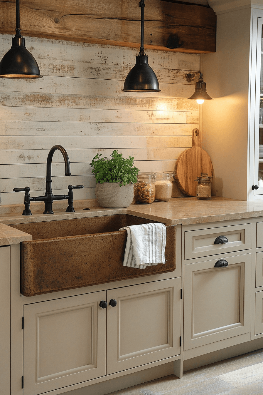
27. Pick a composite sink in a warm, blending tone.
White porcelain creates a stark contrast. Stainless steel clashes with the warmth.
A composite sink in sand, biscuit, or warm stone melts into your countertop. The visual flow stays intact. The kitchen reads as one continuous, intentional design.
28. Group decorative items in odd numbers.
Three canisters. Five books leaning together. One board propped against the backsplash.
Odd groupings satisfy the eye in a way even numbers don’t. Designers rely on this principle constantly. Now it’s yours to use.
29. Study your saved pins — and look for the patterns.
Open your boards. Scroll through the kitchens that stopped you cold.
What do they share? Same undertones. Same interplay of texture and simplicity. Same deliberate restraint.
That analysis — that careful observation — teaches you more than any product purchase ever could. When you can see the pattern, you can build it. Intentionally. Confidently. Without second-guessing.
Your Beige Kitchen Isn’t a Fantasy — It’s a Plan
A beautiful kitchen doesn’t demand the biggest budget. It demands the smartest choices.
Texture. Light. Undertones. Restraint.
Beige hands you the warmest, most versatile canvas imaginable. But it rewards intention and punishes carelessness in equal measure.
Don’t rush this. Don’t impulse-buy under bad store lighting. And don’t let the distance between your dream kitchen and your current one keep you frozen.
Grab this list. Work through it trick by trick. Build the kitchen that doesn’t just photograph well — but makes you linger over your morning coffee because leaving the room feels like a loss.
That kitchen is closer than you think.
Now you know exactly how to get there.